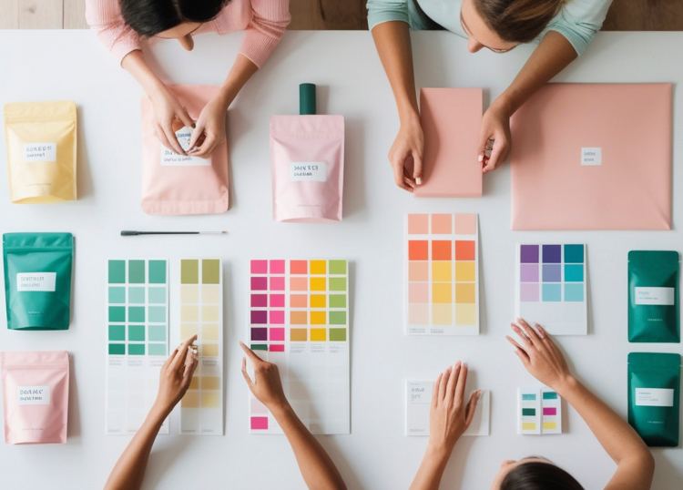
Colour is often one of the first things people notice about a product, website, shop, or advertisement. Before a customer reads the message or studies the details, colour has already started shaping their impression.
This does not mean that one colour will always produce the same response. Context, culture, age, personal experience, and the type of product all influence how colour is interpreted. Even so, colour remains an important part of how customers form opinions and make buying decisions.
Colour Shapes First Impressions
Customers often make rapid judgements about whether a brand feels trustworthy, affordable, premium, modern, playful, or traditional.
Colour plays a significant role in these early impressions.
A muted, neutral palette may suggest calmness and sophistication, while bright colours may feel energetic and informal. Dark colours can create a sense of authority, while softer tones may appear more approachable.
These associations are not fixed rules, but they influence how a brand is perceived before any detailed interaction takes place.
Colour Supports Brand Recognition
Consistent use of colour helps customers recognise a business across different platforms.
A strong colour system may appear on:
- Logos
- Packaging
- Websites
- Social media graphics
- Store signage
- Printed marketing material
- Staff uniforms
When colours are used consistently, they become closely linked to the brand. Over time, customers may recognise the colour combination before they even notice the company name.
Different Colours Suggest Different Qualities
Colours are often connected with certain emotions or ideas, although meanings vary between audiences and cultures.
Common associations include:
- Blue with trust, calmness, and reliability
- Red with urgency, energy, and excitement
- Green with nature, health, and sustainability
- Yellow with warmth, optimism, and attention
- Black with sophistication, strength, and exclusivity
- White with simplicity, cleanliness, and space
- Purple with creativity, luxury, and individuality
- Orange with friendliness, enthusiasm, and action
These associations can guide design decisions, but they should always be considered alongside the brand's audience and purpose.
Colour Can Influence Perceived Value
The way a product is presented can affect how expensive, practical, or desirable it appears.
Premium brands often use restrained colour palettes, high contrast, and generous white space to create a polished appearance. Budget-focused brands may use bold colours and prominent price messaging to communicate value and immediacy.
The same product can feel very different depending on the colours used in its packaging, website, or display.
Colour Directs Attention
Colour is also used to guide customers towards specific information or actions.
On a website, a contrasting button may draw attention to actions such as:
- Book now
- Add to basket
- Request a quote
- Contact us
- Sign up
- Learn more
The effectiveness of a button does not depend on one universally successful colour. What matters most is contrast, visibility, and consistency within the overall design.
Colour Affects Product Expectations
Customers often use colour to make assumptions about taste, quality, function, or performance.
For example, green packaging may suggest natural ingredients, while black packaging may imply a premium product. Soft pastel colours may appeal to customers looking for gentle or comforting products, while bright colours may suggest bold flavours or strong performance.
When colour aligns with the product and audience, it can make the offer easier to understand.
Cultural Context Matters
Colour meanings can differ significantly between cultures.
A colour associated with celebration in one country may represent mourning or caution in another. Businesses operating in multiple regions should avoid assuming that the same visual approach will work everywhere.
Local research is particularly important when designing packaging, campaigns, or websites for culturally diverse audiences.
Personal Preference Still Plays a Role
Not every customer responds to colour in the same way.
Age, gender, background, personality, and previous experiences can all affect colour preference. This is why businesses should avoid relying on general colour stereotypes without testing them against real customer behaviour.
A colour choice should support the brand strategy rather than replace audience research.
Test Colour Choices in Real Situations
The best way to assess colour effectiveness is to test it in context.
Businesses can compare:
- Website button colours
- Packaging variations
- Advertisement designs
- Email layouts
- Product labels
- Landing page sections
Testing can show whether one version leads to more clicks, enquiries, purchases, or engagement.
Keep Accessibility in Mind
Colour should never be the only way important information is communicated.
Good visual design should include:
- Strong contrast between text and background
- Clear labels
- Readable font sizes
- Symbols or text alongside colour indicators
- Designs that remain understandable for people with colour vision deficiencies
Accessible design improves usability and helps more customers interact confidently with a brand.
Final Thoughts
Colour psychology can influence how customers interpret a brand, notice information, and respond to products or offers. However, colour works best when it is supported by clear messaging, consistent branding, audience research, and accessible design. Businesses that choose colours thoughtfully can create stronger first impressions and make the buying process easier to understand.