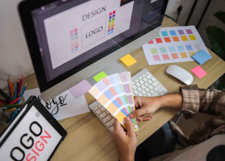
A visual identity is often reduced to a logo, but customers experience a brand through far more than a single graphic. Colour, typography, photography, illustrations, layouts, icons, signage, packaging, and digital design all contribute to how a business is recognised.
The challenge is creating an identity that feels appropriate now without becoming dated within a few years.
A lasting visual identity isn't necessarily one that never changes. It has a strong foundation that can adapt without losing the characteristics that make the brand recognisable.
Start With the Brand, Not the Design
Before choosing colours or discussing logo concepts, establish what the business needs to communicate.
Consider questions such as:
- Who is the target audience?
- What does the business offer?
- What differentiates it from competitors?
- How should customers perceive the brand?
- Where will the identity appear most frequently?
Design decisions become much easier when they're based on a clear understanding of the business.
Keep the Logo Practical
A logo needs to work in far more places than the top of a website.
It may eventually appear on:
- Business cards
- Social media profiles
- Signage
- Vehicles
- Uniforms
- Packaging
- Advertising
- Documents
A highly complicated logo may look impressive at a large size but become difficult to recognise when reduced to a small social media icon.
Good logo design considers different sizes, backgrounds, formats, and applications from the beginning.
Choose Colours With a Purpose
Colour is one of the quickest ways for people to recognise a brand.
A useful colour palette usually includes primary colours alongside supporting colours that provide enough flexibility for different applications.
When selecting colours, consider:
- Brand personality
- Target audience
- Competitor identities
- Digital applications
- Print reproduction
- Accessibility and contrast
Avoid choosing colours purely because they're currently fashionable. Trends change quickly, while a visual identity may need to serve the business for many years.
Typography Shapes How a Brand Feels
Typography has a significant influence on brand perception.
Different typefaces can make a business feel formal, approachable, technical, traditional, contemporary, playful, or understated.
A practical typography system should define fonts for purposes such as:
- Headings
- Subheadings
- Body copy
- Buttons
- Captions
- Marketing materials
Readability should remain a priority, particularly for websites and longer pieces of content.
Create a Consistent Image Style
Photography and imagery are sometimes overlooked when visual identities are developed.
If one campaign uses polished studio photography, another uses casual smartphone images, and the website relies heavily on generic stock photographs, the brand can quickly feel inconsistent.
A visual identity can establish guidance around:
- Photography style
- Subject matter
- Lighting
- Composition
- Illustration
- Image treatment
- Graphic elements
Consistency doesn't mean every image needs to look identical. It means there should be enough commonality for the material to feel as though it belongs to the same brand.
Don't Design Around Every Current Trend
Design trends can provide useful inspiration, but building an entire identity around a fashionable style creates the risk of rapid ageing.
Trends involving gradients, particular typefaces, illustration styles, layouts, and visual effects can become strongly associated with a specific period.
A more durable identity usually relies on strong fundamentals:
- Clear typography
- Appropriate colour
- Recognisable visual elements
- Practical layouts
- Consistent application
Trends can then influence campaigns or supporting material without defining the entire brand.
Make the Identity Flexible
Businesses rarely remain exactly the same.
They may introduce new services, enter different markets, open additional locations, or start communicating through platforms that didn't exist when the original identity was created.
A flexible visual system can accommodate these changes.
This might involve:
- Multiple approved logo configurations
- A broader supporting colour palette
- Flexible layout principles
- Adaptable graphic elements
- Digital and print applications
Flexibility allows the identity to change with the business without requiring a complete redesign every few years.
Consistency Builds Recognition
Even a strong visual identity loses effectiveness when it is applied differently every time.
Customers should encounter a recognisable visual language whether they're looking at:
- Your website
- An advertisement
- A proposal
- Social media
- Packaging
- Signage
- Email communication
Repeated exposure to consistent visual elements helps people associate those elements with the business.
Create Clear Brand Guidelines
Brand guidelines provide practical instructions for applying the identity consistently.
They may cover:
- Logo usage
- Logo spacing
- Colour specifications
- Typography
- Photography
- Icons
- Graphic elements
- Layout examples
- Incorrect applications
Guidelines don't need to restrict creativity. Their purpose is to establish enough consistency that different designers, employees, agencies, and suppliers can produce material that still feels connected.
Design for Digital and Physical Applications
A visual identity shouldn't be created for one medium alone.
A brand that works beautifully on a large desktop screen may struggle when reduced to a mobile display. Similarly, colours that look good digitally may behave differently when printed or applied to physical materials.
Test the identity across realistic applications before finalising it.
These might include:
- Mobile screens
- Websites
- Social media
- Email signatures
- Printed documents
- Outdoor signage
- Merchandise
Real-world testing often identifies practical problems that aren't obvious when viewing individual design concepts.
Know When Evolution Is Better Than Reinvention
A visual identity doesn't need to remain untouched forever.
As a business changes, certain elements may begin to feel dated or no longer represent the organisation accurately.
That doesn't always mean starting again.
Sometimes an identity can be refreshed through:
- Updated typography
- Refined colours
- Simplified logo details
- New photography
- Improved layouts
- Better digital applications
Retaining recognisable elements can preserve existing brand recognition while bringing the identity up to date.
Think Beyond Personal Preference
Visual identity decisions can easily become subjective.
Business owners may naturally prefer certain colours, fonts, or styles, but personal taste shouldn't be the only consideration.
The more useful question is whether the design communicates effectively with the intended audience and supports the position of the business.
A visual identity should serve the brand rather than simply reflect the preferences of the people approving it.
Final Thoughts
Building a visual identity that lasts requires more than designing an attractive logo. Colour, typography, imagery, layouts, graphic elements, and consistent application all contribute to how people recognise and remember a business.
The strongest identities have clear foundations without becoming unnecessarily rigid. They are distinctive enough to be recognised, practical enough to work across different applications, and flexible enough to change as the business develops.
Rather than chasing whatever design style happens to be popular at the moment, focus on creating a visual system that accurately represents the business and can continue doing so for years to come.