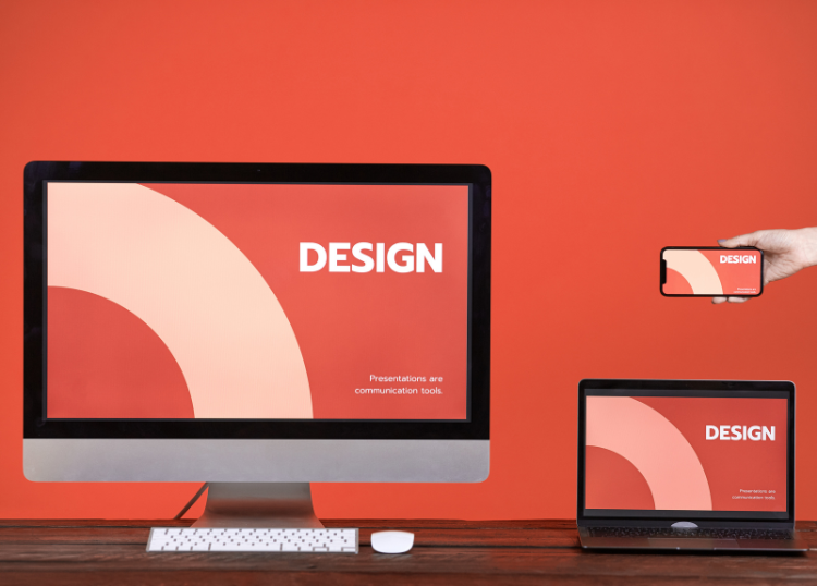
In 2026, mobile-first design will be a cornerstone of digital strategy, driven by the dominance of mobile devices in user interactions. With over 60% of global internet traffic coming from mobile devices, businesses must prioritize designing websites and applications that perform seamlessly on smartphones and tablets. This approach ensures that the growing number of mobile users—projected to reach 7.5 billion by 2026—have intuitive, efficient, and engaging experiences.
The Rise of Mobile Usage
Mobile devices have become the primary way people access the internet. Data from 2025 shows that mobile users spend an average of 4.8 hours daily on their devices, with 90% of that time on apps or mobile browsers. This trend is fuelled by the proliferation of affordable smartphones, faster mobile networks like 5G, and the increasing preference for on-the-go access to information, shopping, and services. By 2026, mobile commerce is expected to account for 50% of global e-commerce sales, making mobile-first design critical for businesses aiming to capture this market.
Why Mobile-First Design Matters
Mobile-first design focuses on creating a seamless experience for mobile users before scaling up to larger screens. This approach aligns with user behaviour and offers several key benefits:
- Improved User Experience: Mobile-first design prioritizes simplicity, speed, and usability. By focusing on smaller screens, designers create clean interfaces with intuitive navigation, ensuring users can complete tasks quickly. For example, streamlined menus and touch-friendly buttons reduce friction, keeping users engaged.
- Faster Load Times: Mobile users expect near-instant load times. A mobile-first approach emphasizes lightweight code, optimized images, and minimalistic design to deliver fast performance, even on slower networks. Google’s research indicates that 53% of mobile users abandon a site if it takes longer than three seconds to load.
- SEO Advantages: Search engines like Google prioritize mobile-friendly websites. Since 2020, Google has used mobile-first indexing, meaning it primarily crawls the mobile version of a site to determine its ranking. By 2026, sites not optimized for mobile will likely see significant drops in search visibility.
- Business Growth: A mobile-first strategy drives conversions. For instance, retailers with mobile-optimized checkout processes report up to 30% higher conversion rates. As mobile commerce grows, businesses that fail to adopt this approach risk losing customers to competitors.
Key Elements of Mobile-First Design
To succeed in 2026, businesses must focus on several core principles of mobile-first design:
- Responsive Design: Websites must adapt fluidly to various screen sizes, ensuring consistency across devices. CSS frameworks like Bootstrap or Tailwind CSS simplify this process.
- Touch Optimization: Interfaces should account for touch-based interactions, with buttons and links spaced to prevent accidental taps.
- Content Prioritization: Mobile screens have limited space, so designers must focus on essential content, avoiding clutter.
- Performance Optimization: Techniques like lazy loading, image compression, and minimal JavaScript usage ensure fast load times.
- Accessibility: Designs should comply with WCAG guidelines, ensuring usability for all users, including those with disabilities.
Challenges and Solutions
Adopting a mobile-first approach isn’t without hurdles. Limited screen real estate can make it difficult to present complex information, and varying device capabilities can complicate development. However, solutions like progressive web apps (PWAs) offer app-like experiences without the need for native app development, balancing functionality and performance. Additionally, tools like Figma and Adobe XD allow designers to prototype mobile interfaces efficiently, addressing usability issues early.
The Future of Mobile-First Design
By 2026, emerging technologies will further shape mobile-first design. The rise of foldable smartphones and wearable devices will demand flexible, adaptive interfaces. Artificial intelligence will enable personalized mobile experiences, with AI-driven chatbots and dynamic content tailoring interactions to user preferences. Additionally, 5G’s widespread adoption will support richer media, such as AR and VR, requiring designers to rethink mobile interfaces to accommodate immersive features.
Staying Ahead in 2026
Businesses must act now to prepare for the mobile-driven future. This means investing in mobile-first design tools, training teams on best practices, and regularly testing user experiences across devices. Analytics tools like Google Analytics and Hotjar can provide insights into mobile user behaviour, guiding iterative improvements. By prioritizing mobile users, businesses can build loyalty, drive engagement, and stay competitive in a mobile-dominated digital landscape.
For more relevant articles visit Our Home Page or Webchanges