A website is more than a digital storefront—it’s a critical touchpoint that shapes customer perceptions and drives conversions. Poor design can silently repel potential customers, undermining even the most well-crafted campaigns. Based on analysing user behaviour and refining online experiences, here are seven common design mistakes costing business—and how to fix them immediately.
1. Cluttered Layouts Overwhelm Users
A chaotic homepage with too many elements—banners, pop-ups, or dense text—confuses visitors. Data shows users form opinions about a site in under a second. If they can’t quickly find what they need, they’ll leave. Simplify the layout with clear sections, ample white space, and a logical flow. Prioritize key calls-to-action (CTAs) like “Shop Now” or “Contact Us” to guide users effortlessly.
2. Slow Load Times Kill Engagement
Speed matters. Studies reveal 40% of users abandon a site if it takes over three seconds to load. Slow sites also hurt SEO rankings, making it harder for customers to find the site. Use tools like Google PageSpeed Insights to identify issues. Compress images, minimize code, and leverage caching to keep the site fast and responsive.
3. Non-Responsive Design Alienates Mobile Users
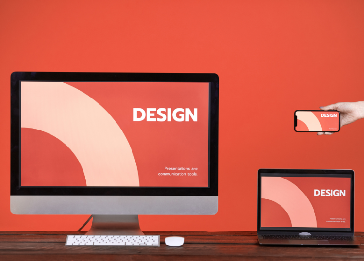
With over 60% of web traffic from mobile devices, a site that doesn’t adapt to smaller screens is a dealbreaker. Non-responsive designs frustrate users with pinched zooming or misaligned buttons. Test the site across devices to ensure it’s mobile-friendly. Frameworks like Bootstrap or responsive themes in platforms like WordPress can streamline this process.
4. Poor Navigation Frustrates Visitors
If users can’t find what they’re looking for in a few clicks, they’ll bounce. Complex menus or vague labels like “Solutions” instead of “Products” create friction. Streamline navigation with descriptive, concise menu items. Include a search bar and breadcrumb trails for deeper pages to keep users oriented.
5. Weak Visual Hierarchy Misguides Attention
A site without clear visual cues fails to direct users to what matters most. Bold headlines, contrasting CTA buttons, and strategic use of colour guide the eye naturally. For example, make the primary CTA button a bright colour that stands out against a neutral background. Avoid overloading pages with competing visuals that dilute focus.
6. Inconsistent Branding Erodes Trust
Inconsistent fonts, colours, or messaging can make a site feel unprofessional. Customers need to instantly recognize the brand’s identity. Align the website’s design with brand guidelines—use the same logo, colour palette, and tone as other marketing materials. Consistency builds credibility and familiarity.
7. Lack of Trust Signals Deters Conversions
Skeptical customers won’t buy or share details without reassurance. Missing trust signals like customer reviews, security badges, or contact information raise red flags. Display testimonials prominently, add SSL certificates (and show the padlock icon), and include clear contact details. These additions can significantly increase conversions.
Final Thoughts
A website is a powerful tool for engaging customers, but these seven design mistakes can sabotage efforts. By addressing cluttered layouts, slow load times, non-responsive design, poor navigation, weak visual hierarchy, inconsistent branding, and missing trust signals, a seamless user experience can keep visitors returning. Audit the site today, prioritize these fixes, and watch conversion rates improve.
For more relevant articles visit Our Home Page or Webchanges